KIX LOGO
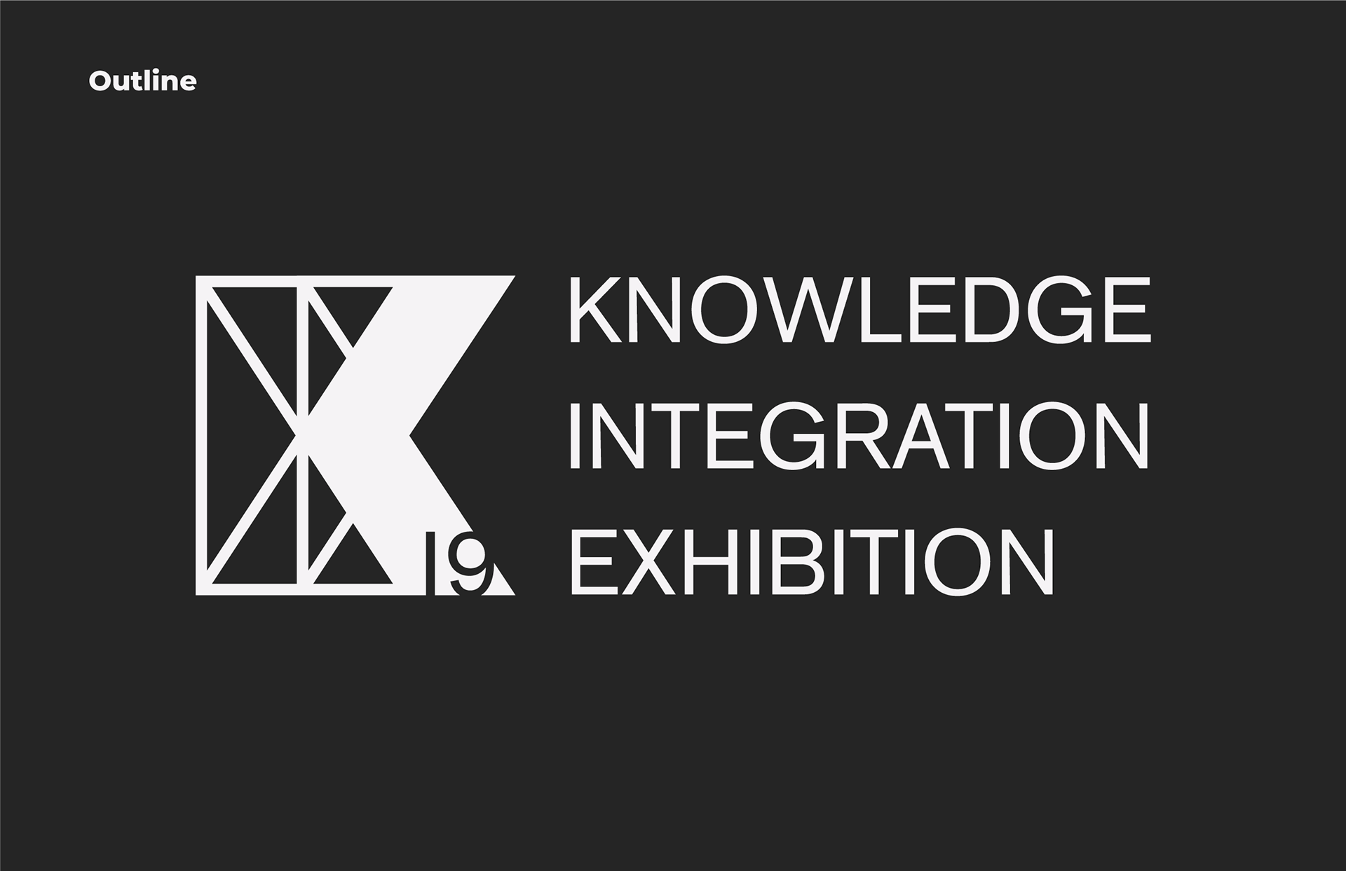
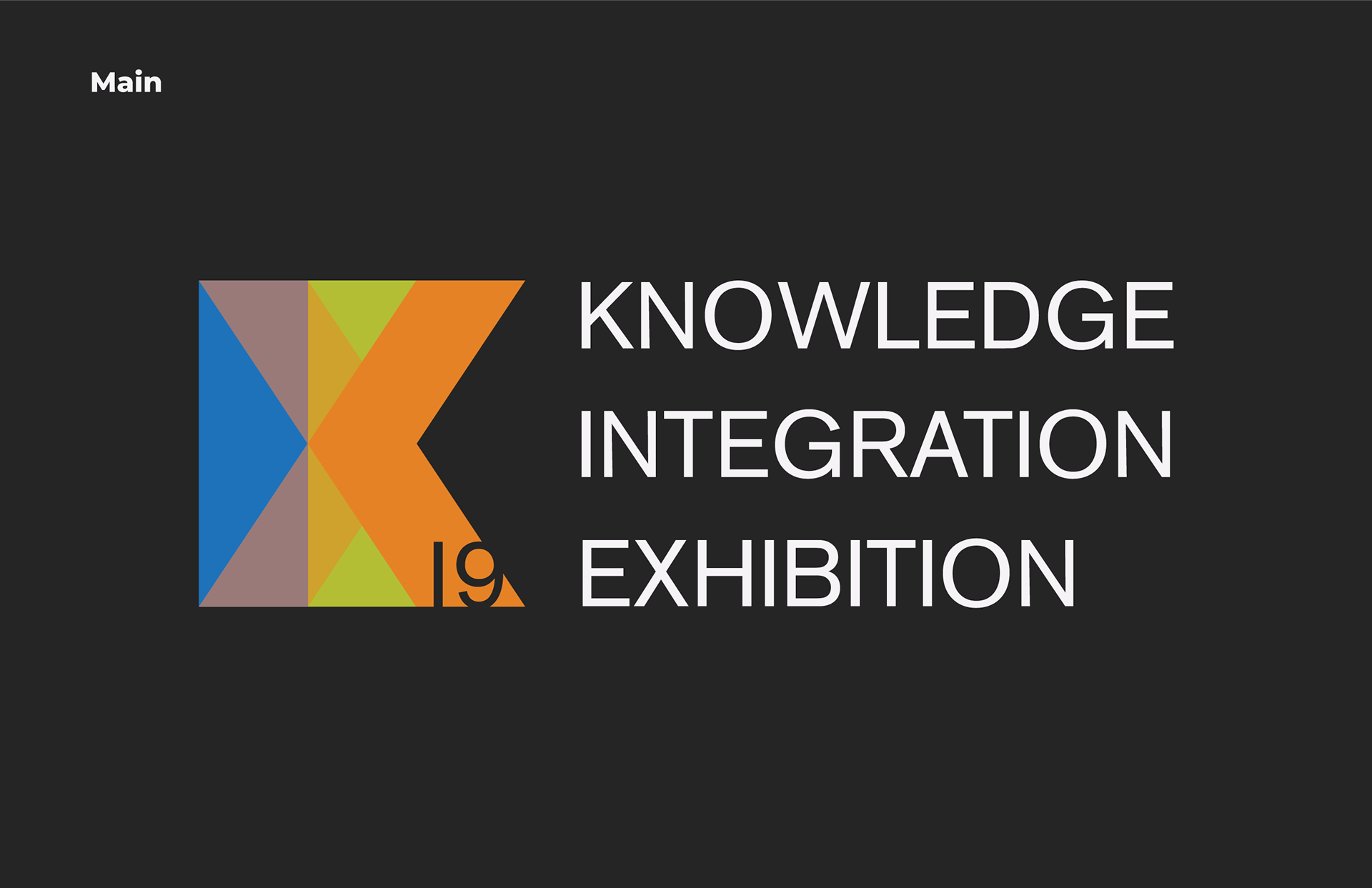
A logo and branding identity for the Knowledge Integration Exhibition 2019.
Role: Project owner
Methodologies: Graphic Design, Branding
Context: Volunteer
Date: Jan 2019 - 4 Weeks
The ask
As part of the Bachelors of Knowledge Integration, students enroll in a four-part Museum Course. For the 2019 Knowledge Integration Exhibition, I was commissioned to develop a logo and overall brand coherence. The logo draws on fundamental values that drive KIX each year and pays homage to previous logos. In addition to a logo, I designed a set of posters to highlight each of the five exhibits on display.
Design process
Initially I worked alone to develop a wide variety of design options, which would be brought to a group of designers for review. As this logo is redesigned annually I looked back at previous years to gain inspiration.
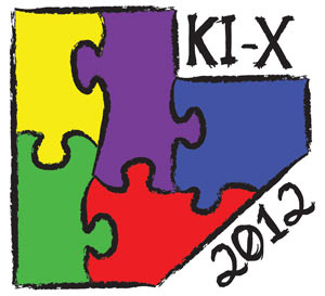
KIX 2012 Logo
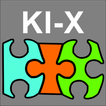
KIX 2013 Logo
KIX 2014 Logo
KIX 2015 Logo

KIX 2016 Logo
KIX 2017 Logo
KIX 2018 Logo
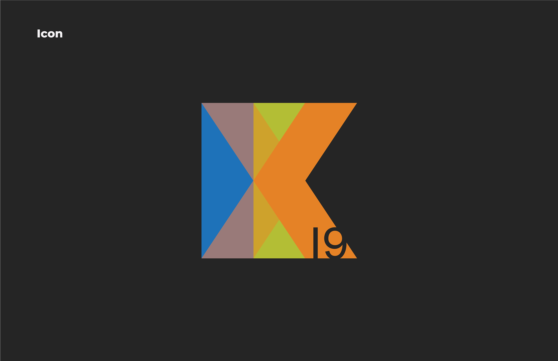
After consultation with a group of designers, these four logo versions below were selected for presentation. The logo presentation was given to all the stakeholders followed by a design discussion. It became evident that it was important for the logo to be dated and needed to work on black and white apparel. I took this feedback and integrated a 19 into the main icon, as well as a stencil version which could be used as a black or white logo.
Colours
The three primary colours green, orange, and blue are drawn from the official faculty colours at the University of Waterloo. Green is the colour of the faculty of Environment, orange for Arts, and Blue for Science. Knowledge integration is in the faculty of environment but encourages students to collaborate across disciplines. KI students take a variety of courses from multiple faculties and combine this knowledge for KIX. The representation of the faculties where KI students take the most courses highlight the multitude of skillsets used during the KIX design process.
Posters
In addition to the logo, posters were commissioned for the physical and digital marketing campaign. Five posters were designed, one for each of the five unique exhibits. Each group was prompted to create an impact statement that would serve as the attention grabber. The poster is designed to be cohesive with the logo and branding by using elements of the logo throughout the poster. The poster was designed with the A.I.D.A model in mind. The iteration process lasted two weeks with many stakeholders involved.
